Trade shows give businesses the golden opportunity to showcase their brand and engage with their potential clients. However, often, businesses invest their money and time into these trade shows without getting the return they had hoped for, as mistakes can undermine their success.
If you are planning to be a part of a trade show, then these are the mistakes you must avoid with your banner stand trade show.
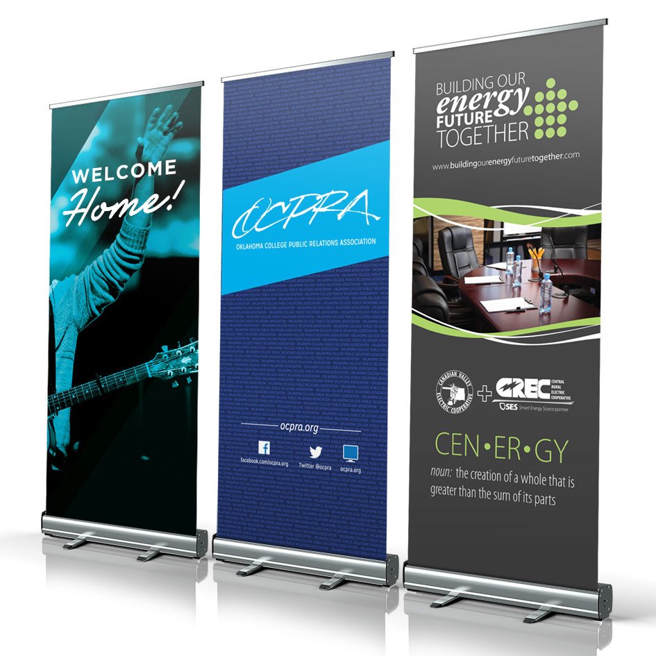
Overcomplicating the Design
Poor Brand Representation
Weaken Hierarchy Information
Using Too Many Fonts
Choosing Poor Quality Images
Not Correcting Typos
Not Choosing Durable Materials
Forgetting the Context of Display
Not Adding a Clear Call-to-Action
Neglecting White Space
Using Incorrect or Outdated Information
When it comes to the trade show banners and stands, simplicity is the key. Sure, you might be tempted to add every possible piece of information about your product, service, or brand, but cluttered visuals and too many elements can overwhelm your potential customers. You don’t want your visitors to feel unsure or confused about where you focus. Rather, concentrate on a clean design that communicates the core message of your brand.
Know that most of the time than not, less is more. Focus on one key message that will resonate with your potential customers. Choose bold headlines and add bullet points to convey your message at a glance.
Inconsistent branding elements in your trade show banner stands or pop up trade show displays, such as confusing messages or mismatched colors, can leave your attendees confused. This, in turn, can weaken your brand identity. Maintaining a consistent brand identity throughout the trade show booth is essential for strengthening brand recognition. It can leave a lasting impression on your customers.
Even if you have banner stands or custom pop up displays with strong visuals, it can fail if the information hierarchy is muddled. Consider how the eye moves. First. you have to place your logo or headline, then add the supporting details naturally. Without a proper hierarchy, the trade show product can feel flat. For instance, if you hide the CTA in small text, you risk the audience missing it. Both the size and placement of each text are important. Rather than focusing on artistic preference, guide the attention of your target audience deliberately.
One way to turn off the audience is to use too many fonts in your trade show banner stands. Apart from hurting readability, using excessive fonts can appear messy and haphazard. It is essential that you use a font that is easier to read. As a general guideline, sans-serif fonts are easier to read. If you can, stick to your brand fonts.
Images with low resolution or blurry graphics can make the banner stand appear unprofessional. This will deter your target audience. It is essential that you choose high-resolution images that are adequate for large-format printing. Make sure that the visual elements are clear and sharp, no matter how much you enlarge them. In case you are unsure about the resolution of the graphic design, you can seek professional advice.
Even a minor, easily overlooked error can seriously harm your professionalism and brand image. It is essential that you proofread each element on the banner stand before you send it for printing. Double-check for grammatical and spelling mistakes. Also, don’t forget to look for factual inaccuracies. Use a multi-stage proofreading process. After you review them, have someone else review them for missed errors.
The material of your trade show banner stand might be durable enough to withstand the environment of the event. In case your banner stand will be outdoors, choose weather-resistant materials. But if it will be kept inside the tent, then you can go for lightweight materials. Moreover, your banner stand must be wrinkle-free. This will make the stand appear more professional and polished.
A banner stand does not exist in isolation. It competes with crowd movement, lighting, and surrounding visuals. Often, banner stand designs are finalized without considering the real setting. A dark color banner stand against a black wall will be invisible. Or a small one used against a big hall can be dwarfed by the towering displays of competitors. This reduces the impact and wastes your investment money. So, consider contrast, scale, and placement before designing the banner.
A banner with a straightforward call-to-action is a missed opportunity. What would you like your target customers to do after they are done checking your banner? Visit your website or scan a QR code? If you fail to guide them, they are just going to move on. Make your call-to-action visible. Phrases, such as ‘Get a Free Demo’ or ‘Visit Us Today can make a significant difference.
Many businesses feel the need to fill every inch of their banner. However, this can backfire. A lack of white space can make the design appear cramped and difficult to read. White space can guide the eyes of the viewers and boosts overall clarity. It ensures your key elements stand out rather than competing for attention. A clean design is always more effective than a cramped one.
Displaying incorrect or outdated information or contact details can harm your credibility and lead to missed information. Before printing your banner, make sure you double-check everything, including the website URL, phone number, email address, and social media handles. Keep the information updated so that your prospective customers can reach out to you after the event if they are interested.