Every great room begins with a foundation, and few foundations make as immediate or as lasting an impression as a deep, richly coloured floor covering. The decision to introduce a strong, warm hue into a living space is not one to be taken lightly, but when executed well, it is one of the most rewarding design choices a homeowner can make. Colour psychology tells us that warm tones like crimson, burgundy, and scarlet stimulate energy, warmth, and conversation — making them a natural fit for spaces where people gather. From ancient palaces to contemporary penthouses, this particular hue has endured centuries of shifting trends and remained relevant because it speaks a visual language that transcends time and fashion.
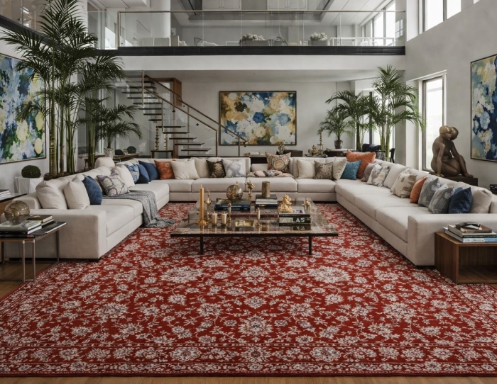
There is something uniquely commanding about a deep red floor covering. It draws the eye downward and anchors a room in a way that no neutral ever could. It pairs beautifully with rich wood furniture, metallic accents, and both light and dark walls. It can be traditional or modern, maximalist or surprisingly restrained, depending on how it is used. Understanding how to harness this power is the key to getting the most out of this bold but versatile choice.
Why Colour Matters More Than You Think
Colour is the single most emotionally charged element of interior design. Before a visitor reads the furniture, the art on the walls, or the texture of the fabrics, they absorb the dominant colour of the room. A warm, deeply saturated floor sets an immediate tone of welcome and intimacy. Studies in colour psychology consistently show that red and its close relatives prompt feelings of warmth, comfort, and social engagement — precisely the atmosphere most homeowners want in a living room, dining room, or entertaining space.
Beyond emotion, colour also affects how we perceive the dimensions of a room. Darker, warmer tones can make a large, impersonal space feel more intimate and cosy. A vast, echoing room suddenly becomes a place where people want to sit down and stay awhile. Conversely, in a smaller room, the richness of a deep-toned floor covering can add a sense of drama and luxury that makes the space feel more intentional and considered.
Choosing the Right Shade of Red
Not all reds are created equal, and selecting the right shade for your space requires careful consideration. A true, pure red makes a bold contemporary statement and works well in modern, minimalist interiors where it serves as the sole dramatic element. Burgundy and wine tones carry a more traditional, sophisticated character and pair beautifully with antique furniture, dark timber floors, and jewel-toned walls. Brick and terracotta reds lean earthy and organic, complementing natural materials like linen, jute, and unfinished wood.
The existing colour palette of your room should guide your shade selection. If your walls are pale and your furniture neutral, almost any shade of red will work beautifully as the central statement. If your room already features several competing colours and patterns, a more muted, dusty rose-red or a deep wine will integrate more harmoniously than a saturated primary red.
Material Selection for Performance and Beauty
The material of your floor covering determines not only how it looks and feels but also how it performs over years of daily use. Wool remains the gold standard for deep, rich colours because it absorbs dye deeply and evenly, producing a vibrancy and depth that synthetic fibres struggle to replicate. Wool also has the remarkable ability to maintain its appearance under heavy foot traffic, resisting crushing and matting far better than most alternatives.
For those seeking a more budget-conscious option, high-quality polypropylene and nylon synthetics have improved dramatically and now offer impressive colour retention and stain resistance. These are particularly practical in households with children and pets where spills are inevitable. The trade-off is that synthetics rarely achieve the same depth of colour and tactile luxury as natural wool.
Silk and silk-blend options produce extraordinarily rich, lustrous colours that seem almost to glow in the right light. However, silk is delicate and best reserved for low-traffic areas or purely decorative use. A silk-blend, combining silk with wool or cotton, offers a compromise between beauty and practicality.
The Role of Pattern in a Bold Colour Choice
Pattern and colour work together to define the character of a floor covering. A solid, unpatterned piece in a deep red makes the boldest, most modern statement. It is graphic and unambiguous, and it works particularly well in contemporary interiors where clean lines and simplicity dominate.
Traditional patterns such as Persian, Moroccan, and Ottoman designs have featured red carpets prominently for centuries, and for good reason. The intricate geometric and floral motifs in these styles break up the intensity of the colour, distributing it across the surface in a way that feels rich and layered rather than overwhelming. These designs also have the advantage of being forgiving — their complexity means that everyday wear and minor staining are far less visible than on a plain surface.
Geometric patterns offer a middle ground between the simplicity of solid colour and the complexity of traditional design. Bold diamonds, chevrons, and stripes in red and cream or red and charcoal create a striking, contemporary look that references historical design without feeling old-fashioned.
Pairing With Furniture and Walls
A deep, warm floor covering creates a strong foundation that influences every other element in the room. Dark timber furniture — walnut, mahogany, or ebony — sits beautifully against red tones, creating a rich, enveloping atmosphere that feels both luxurious and grounded. Lighter timber, such as oak or ash, provides a pleasing contrast that keeps the space from feeling too heavy.
Neutral upholstery in cream, ivory, camel, or warm grey allows the floor covering to remain the hero of the room without creating visual competition. For those who want a more layered, eclectic look, deep green, navy, and gold work extraordinarily well alongside red tones — these combinations have been used in traditional interior design for centuries precisely because they are so visually satisfying.
Wall colour is equally important. Crisp white walls create a clean, gallery-like backdrop that makes the floor covering pop. Warm off-whites and pale creams are softer and more traditional. For a truly dramatic, immersive effect, consider deep-toned walls in forest green, midnight blue, or even charcoal — these bold combinations create interiors of extraordinary richness and depth.
Placement and Sizing for Maximum Impact
Getting the size right is critical regardless of colour. A piece that is too small for the room will appear insignificant and disconnected from the furniture arrangement around it. Aim for a size that allows at least the front legs of all major seating pieces to rest on the surface, creating a unified, cohesive grouping.
In a dining room, the floor covering should be large enough that chairs remain on it even when pulled out from the table. In a bedroom, a generous piece placed under the lower two-thirds of the bed, extending out on each side, creates a luxurious frame for the most important piece of furniture in the room.
Care and Maintenance of Deep-Toned Floor Coverings
Deep colours, while visually striking, require attentive care to maintain their vibrancy. Regular vacuuming prevents dust and debris from dulling the surface. Rotate the piece every six to twelve months to ensure even exposure to light and foot traffic, preventing uneven fading. For wool options in particular, professional cleaning every one to two years is strongly recommended to restore depth and remove embedded dirt that home cleaning cannot reach.
Spills should always be blotted immediately with a clean, dry cloth, never rubbed. A mild detergent solution and cold water handles most everyday stains effectively. For deep or set-in stains on high-quality wool pieces, engaging a professional cleaner is always the safer choice.
Considering the principles of colour theory in interior design when making your selection will help you understand not just why certain colour combinations work, but how to use them intentionally to create the specific atmosphere you are aiming for. This knowledge is genuinely transformative for anyone serious about creating a beautifully designed home.
A Floor Covering That Commands Attention and Earns Its Place
Making the choice to introduce a deep, warm-toned floor covering into your home is a commitment to boldness, character, and intention. It is not the choice of a decorator who is playing it safe, but of one who understands that the most memorable rooms are those with the confidence to commit to a vision. When chosen thoughtfully — in the right shade, the right material, the right pattern, and the right size — a deeply coloured floor covering does not dominate a room so much as it completes it.
The rooms that stay with us long after we have left them are almost always the ones that made a deliberate choice. They had a point of view. They told a story. A beautifully chosen, richly coloured floor covering is one of the most powerful tools available to any homeowner who wants their space to do exactly that — to speak clearly, warmly, and with unmistakable confidence from the very ground up.
Read more blogs here